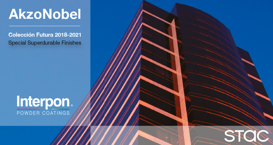
| As part of STAC’s exclusive Colour Experience app, STAC & AkzoNobel present the new colour collection for the Interpon® SuperDurable FUTURA 2018 – 2021 range of powder coated accessories. The FUTURA collection reveals new trends in powder coating and colours. It consists of 50 colours spread over 4 colour palettes with different themes, designed to protect and give colour to symbolic buildings all over the world. Each theme in the collection includes a unique range of colors, textures and effects that reflect the design and societal trends seen throughout the world. Innovation is also highly visible through two completely new finishes: silky and wavy texture. This new collection is based on several globally identified trends for the period 2018-2021: Glam City Time Out Treasured Light Wild Nature |
Jean-Paul Moonen, Global Segment Manager at AkzoNobel Powder Coatings, explains: “The new range of finishes will enable customers to achieve just the right effect in any environment while helping them contribute to the future of green building and sustainable development”.a Jean-Paul Moonen, responsable del Segmento Global de Arquitectura en AkzoNobel Powder Coatings ” La nueva gama de acabados permitirá a los clientes lograr el efecto justo en cualquier entorno al tiempo que los ayudará a contribuir al futuro de la construcción ecológica y el desarrollo sostenible”.
Collection Futura is Sustainable
AkzoNobel is the first major powder coatings manufacturer to achieve a third-party certified Environmental Product Declaration (EPD) for its coatings.
At STAC we believe that architecture and colour go hand-in-hand and we wanted to bring the colours of these new colour palettes to our entire range of accessories. We are sure you’re going to love them.
Modernist influences and baroque trends are back, but the mood is more sophisticated and precious.
The inspiration today is intense, dark tones, centered on reds, blues and greens, in deep and sumptuous nuances. Textures are satiny or shiny, sequined or blackened reflections.
To offset frenzied urban routines, we look to reconnect with the elements, to choose soothing living spaces designed with sustainable materials, capable of providing a sense of wellbeing.
We move towards a range of light tones based on colored whites and softened neutrals, inspired by nature. Textures are matt or satiny, with a sort of frosted shine.
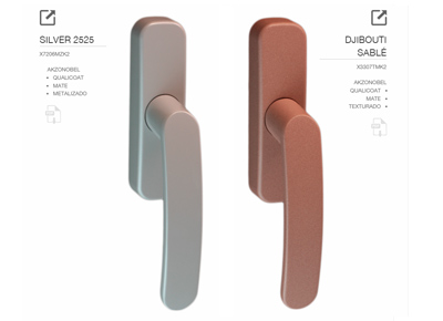
Following an overdose of bling, sensual and more refined versions of metallic brilliance are the new must have.
A range of metallic nuances, including brass, pink gold, pale copper and silver. Luminous textures with delicate brilliance, an anodized effect, discretely shimmering, brushed or with softly chromed reflections.
A new approach to “green” trends exploring a more primitive, wild expression of nature.
A dense range of colors, with mineral and vegetable influences; earthy browns, peaty khakis, anthracite greys and charcoal blacks. Textures and effects are matt, patina, grainy, oxidized, or blurry amalgamated finishes.
Compare all ranges in our app For further information